There are many situations in which a single page website is preferable (and more beneficial) than a traditional multi-page solution. As WordPress consultants, it’s easy to get wrapped up in what we can do as opposed to what’s needed. This is where listening to the clients requirements becomes really important.
What is a single page WordPress website?
A single page website is one in which all the content is arranged on a single page. This type of website is very popular as it offers many advantages over traditional multi-page websites.
Scrolling is a breeze
Now that many of us are using smartphones and tablets to browse, we find that the simple action of scrolling is really easy and intuitive. Apple Mac users will also agree, as scrolling with the track pad is a breeze. This makes navigation simple and direct. Sure, clicking is not difficult either, but navigating menus on mobile devices is not always ideal.
Everything in one place
One page designs present the opportunity to group all your content into a narrative which leads the user through your content in a logical easy to follow manner. This design idea can make it easy to describe complex products and services.
What about the menu
What about the menu? With a one-page website you still have the option to add a menu, it just takes the user to parts of your page instead of separate pages. However, my preference is not to have a menu at all. No menu simplifies the experience as the user only has to scroll up or down to reach any content item on the page.
Flat Design
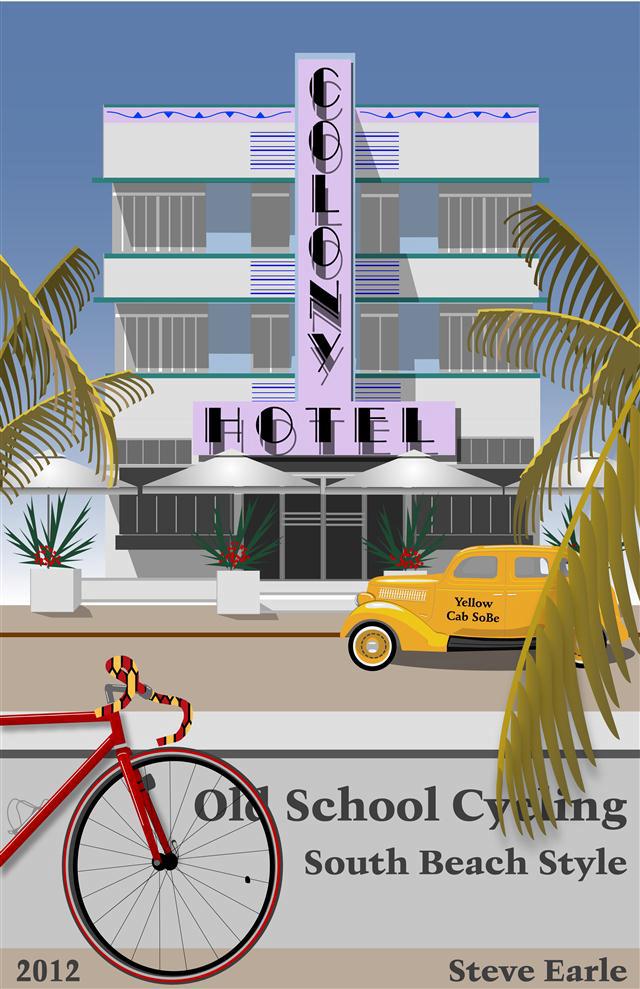
Single page websites really lend themselves to the simplified design concept know as flat design. Flat design demands a simple, minimalist UX that eschews drop shadows, gradients and other 3D graphics enhancements. Flat design works well on the small screen as it focuses the users attention on the content.

An example of ‘flat design’ art created by the author, Steve Earle in 2012 to honor the iconic Colony Hotel in South Beach
By Steve Earle, technology marketing professional
